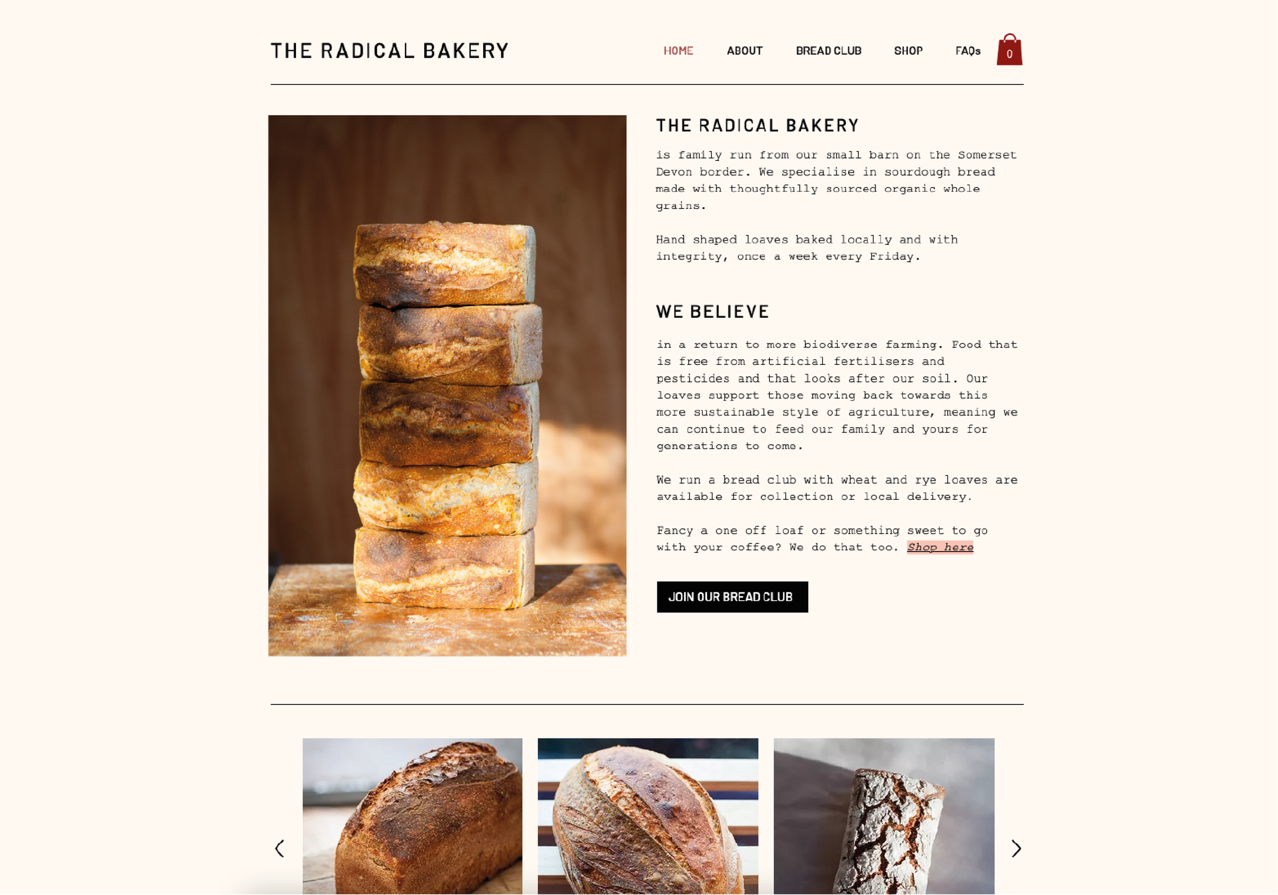
A micro bakery with a big attitude.
Brand Identity for a Radical Micro-Bakery
A small bakery with a big vision—challenging conventional food systems by rethinking our relationship with soil, process, and what we choose to eat. Rooted in regenerative principles, the brand identity draws inspiration from the land itself.
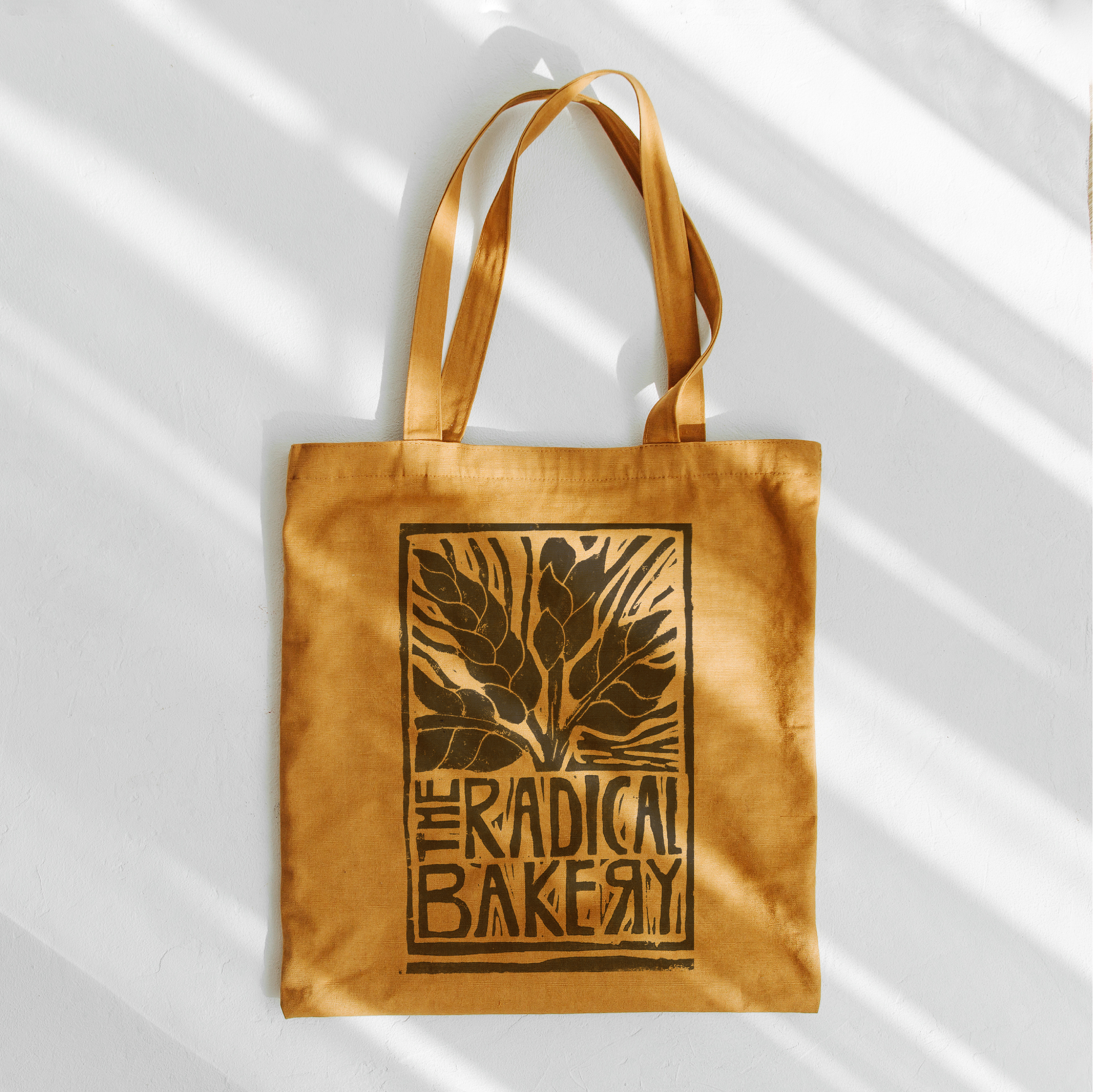
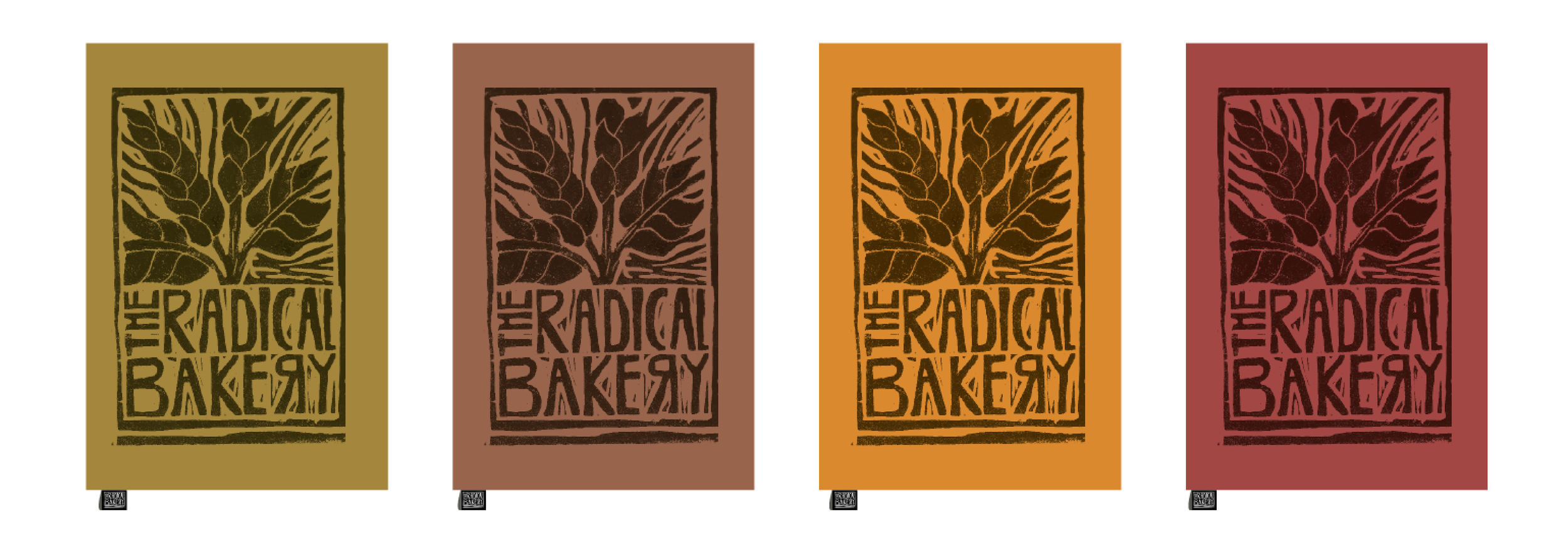
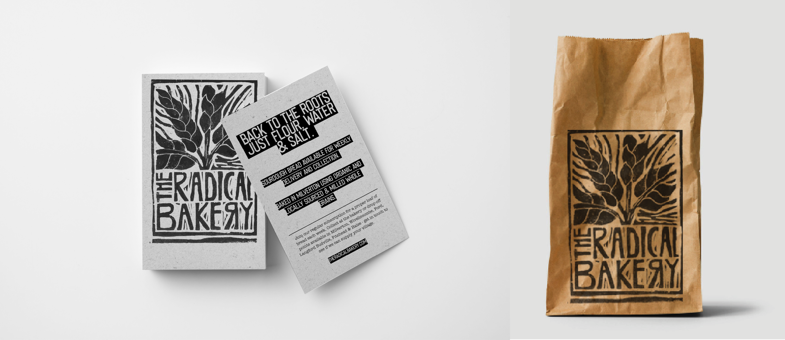
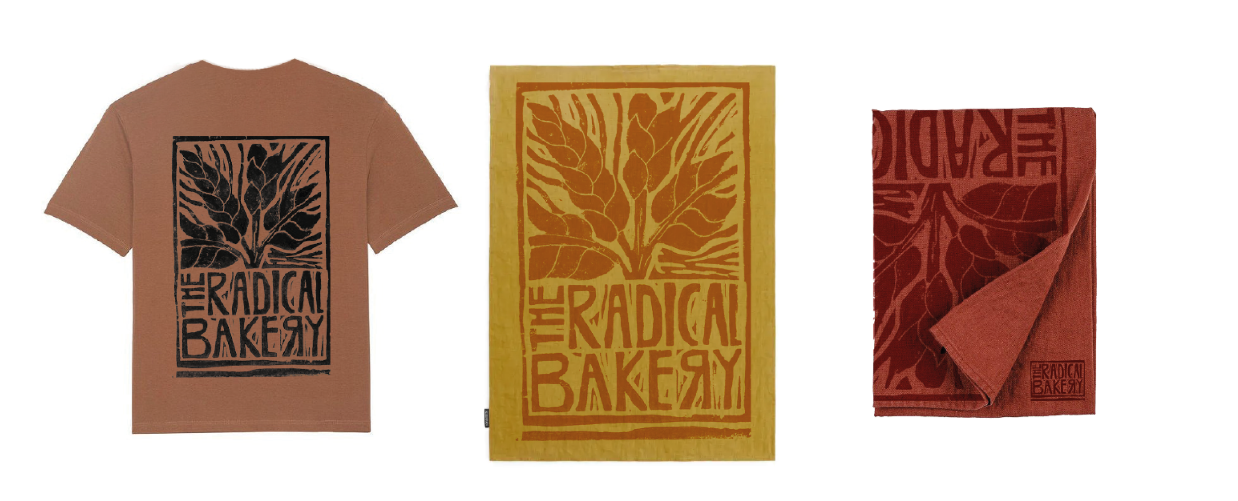
Wheat becomes the central motif of the logo, symbolising a return to the roots of food production. The reversed “R” is a subtle but intentional gesture—hinting at the bakery’s radical ethos and commitment to change. The final mark was hand-cut from lino and block printed, giving it an earthy, tactile feel. Warm, grounded tones reinforce the sense of honesty, care, and connection to the land.
Scope of Work
Art Direction & Design
Hand-Cut Lino Logo
Copywriting
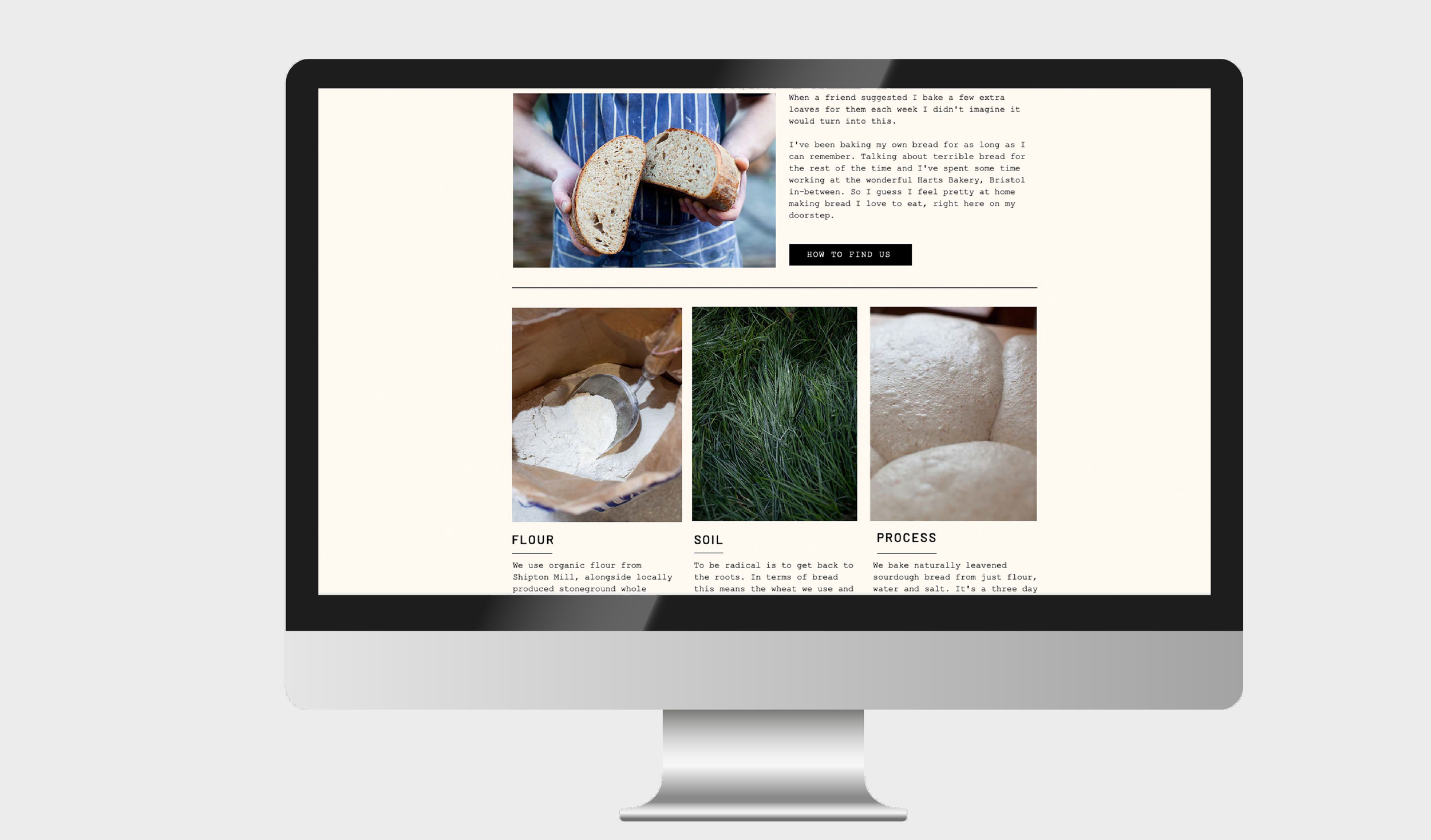
Website